


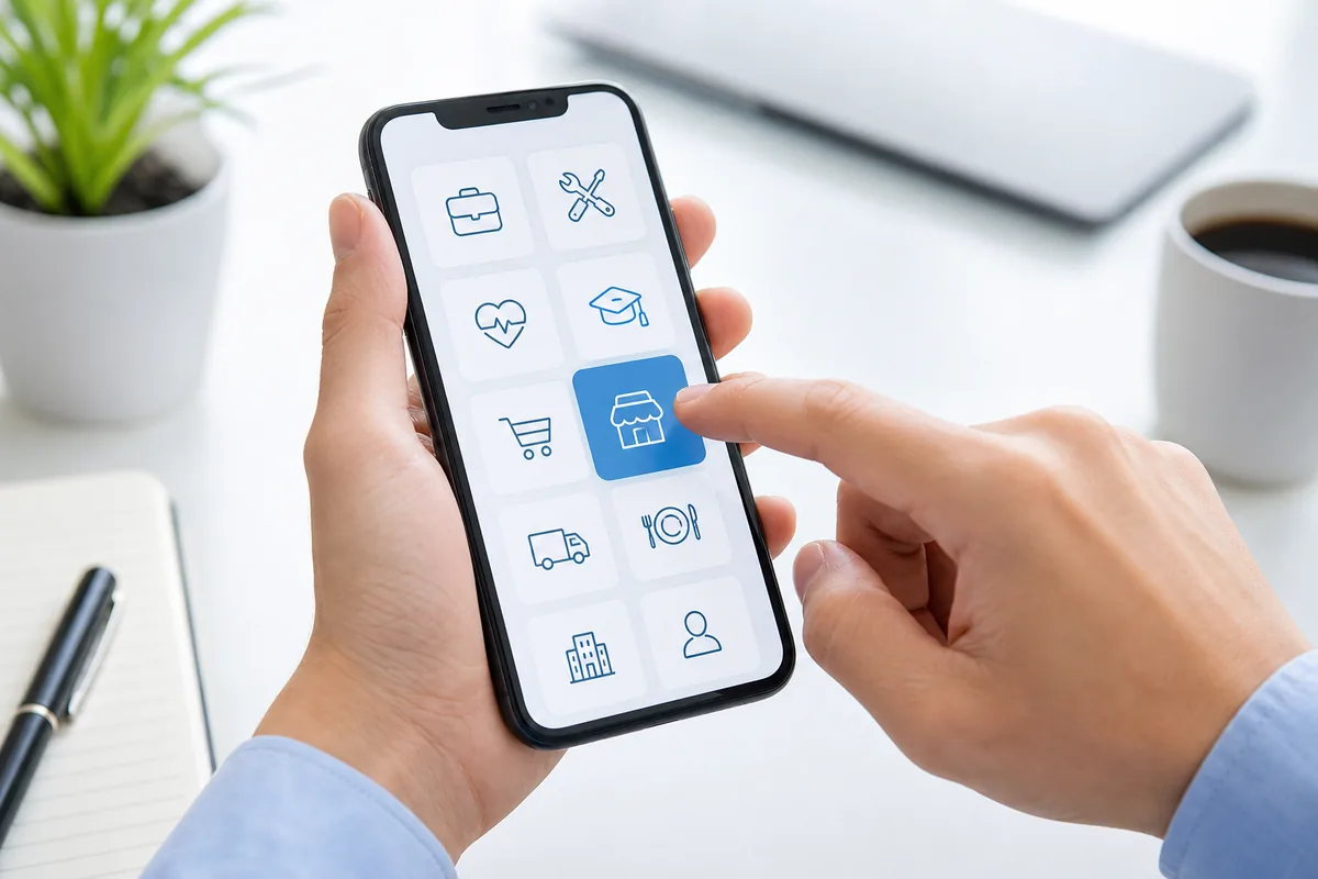


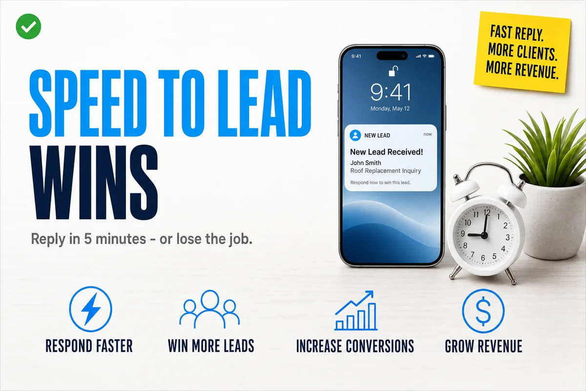
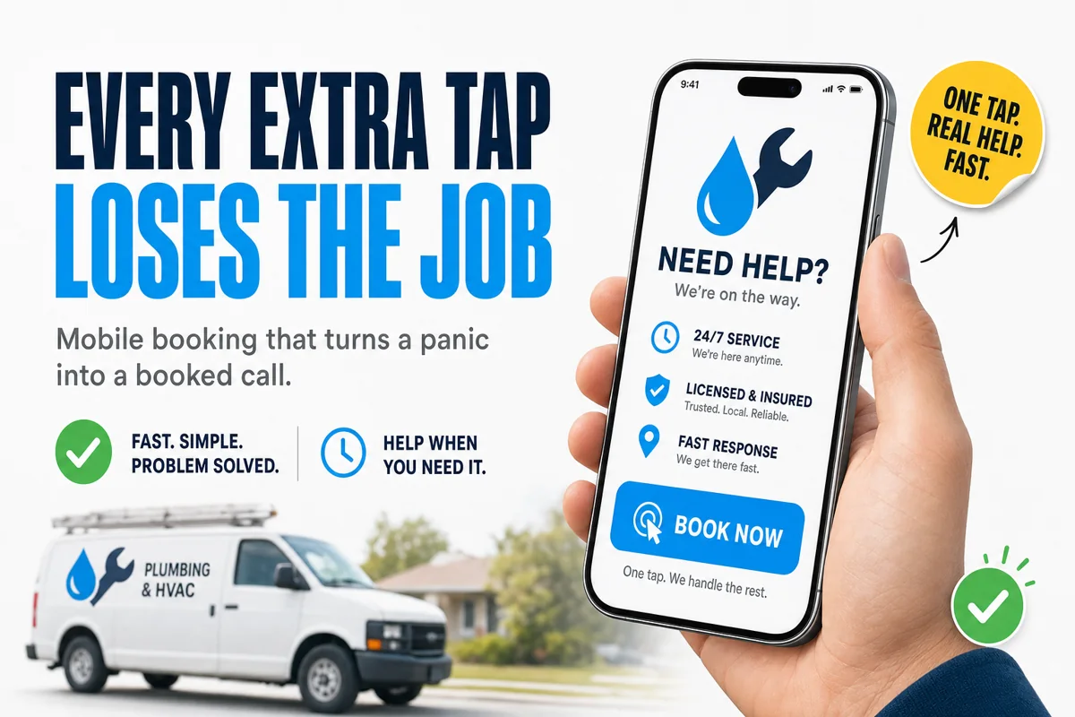

A water heater fails on a Sunday night. The homeowner does not open a laptop and research three companies. They grab the phone on the nightstand, type "emergency plumber near me", and start tapping the first results. Whoever gets them to a booked call with the least friction wins the job — often within ninety seconds, long before price is ever discussed.
For emergency trades — plumbing, HVAC, electrical, water damage, locksmith, garage doors — the website is not a brochure. It is a panic-conversion machine, and almost all of them are quietly broken on the one device that matters: the phone.
- Emergency customers are on a phone in a panic — the site is a panic-conversion machine, not a brochure.
- Make the tap-to-call button sticky and top-of-screen; cut long forms.
- Signal 24/7 and put license, insurance and a rating right at the call button.
- Route planned jobs to longer forms and recurring plans — different intent, different flow.
Where emergency trade sites lose the job
When NTL of NYC audits a trades site, the same friction points show up again and again, and every one of them is a place the caller gives up and dials the next listing:
- The phone number is not tap-to-call. If the number is an image or plain text instead of a
tel:link, a panicked person has to memorize it, leave the site, and dial manually. Many do not bother. - The number is below the fold. On an emergency, the call button has to be the first thing thumbs find — sticky, top of screen, impossible to miss.
- A long contact form stands between intent and action. Name, email, address, message, "how did you hear about us" — for a burst pipe, that is four taps too many. Emergency intent needs one button: call now.
- No after-hours signal. If the site does not scream "24/7 — we answer nights and weekends", the visitor assumes you are closed and moves on.
- Slow load on mobile data. A 5-second load on a phone in a basement with one bar is a lost customer. Emergencies do not wait for hero images to render.
What the booking flow should actually be
For emergency service, the entire mobile experience should collapse to a single decision: call or book, right now. The flow we build:
- Sticky tap-to-call bar pinned to the bottom of every page, with the service area and "24/7 Emergency Service" stated plainly.
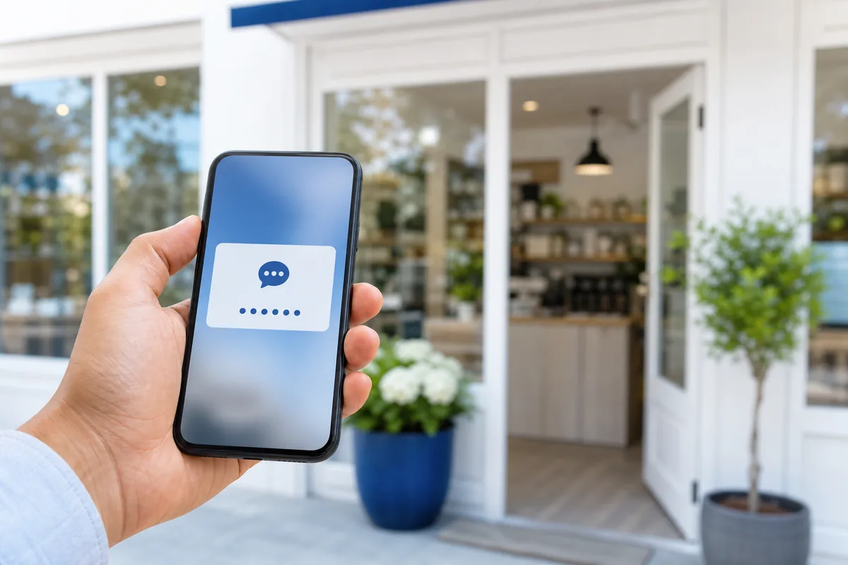
- One-tap "Book Now" for people who would rather not talk — a three-field request (name, phone, problem) that fires an instant alert to dispatch and an automatic text back to the customer.
- Instant confirmation so the panicked homeowner knows a human is coming. Silence after a submission feels like being ignored; an immediate "We got it, a tech will call you in minutes" holds them.
- Trust signals at the decision point — license number, "fully insured", a star rating, and a real photo of a uniformed tech, placed right next to the call button where the doubt lives.
Non-emergency work needs the opposite
The mistake is treating all trade leads the same. A scheduled furnace tune-up or a bathroom remodel quote is a considered purchase — those visitors will happily fill out a longer form and compare options. The site should detect intent and route accordingly: emergency pages strip everything down to the call; planned-service pages can capture more detail and push toward recurring maintenance plans, which is where the real margin lives.
The bottom line
Emergency trades do not lose jobs because their work is worse. They lose because the homeowner in a crisis found an easier "call now" button somewhere else. Fix the mobile booking flow and you capture demand you are already paying to generate — no extra ad spend required, just fewer taps between panic and a booked truck.
Common questions
Why does mobile booking matter so much for emergency trades? Emergency customers are panicked and on their phone, calling whoever is easiest to reach. Every extra tap sends them to a faster competitor.
What is the ideal way to let an emergency customer book? A one-tap call button plus a short, mobile-first booking flow beats a long multi-page form every time in an urgent situation.
Should I show service area or pricing up front? Show enough to remove hesitation, like a clear service-area confirmation and a call-now option, so the customer acts before calling the next company.