


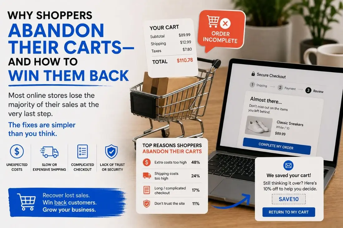


The industry benchmark for cart abandonment hovers around 70%. Seven out of every ten people who add something to a cart never complete the purchase. Most owners shrug at that number because they assume it is normal — and statistically, it is. But the gap between a 70% abandon site and a 50% abandon site is enormous, and the work to close it is mostly tactical, not strategic.
Here is the checklist our e-commerce team works through on every audit. We expect to find 4–6 of these 9 issues on any given site.
- Surprise shipping costs at checkout are the #1 abandonment trigger — show them early.
- Never force account creation; guest checkout is non-negotiable.
- Cluster trust signals and express pay right at the payment step.
- Fixing 4 of these 9 issues took one store from 22% to 34% checkout conversion.
The 9 abandonment triggers at a glance
| # | Trigger | The fix |
|---|---|---|
| 1 | Shipping cost surprise | Show shipping on the product page or cart, with free-shipping thresholds |
| 2 | Forced account creation | Always offer guest checkout; make the account optional at the end |
| 3 | Slow checkout pages | Profile checkout separately; apply Core Web Vitals discipline |
| 4 | Weak trust signals | Cluster badges, reviews and return policy at the payment step |
| 5 | Limited payment options | Add Apple Pay, Google Pay, PayPal, Shop Pay, Klarna/Afterpay |
| 6 | Mobile not really mobile | Real mobile-first checkout: big tap targets, correct inputmode |
| 7 | Hidden return policy | Link it from cart and checkout; state it plainly |
| 8 | No social proof in cart | Honest stock and review cues — never fake scarcity |
| 9 | Hostile error states | Preserve the form, name the exact problem, suggest the fix |
1. Shipping cost surprise at checkout
Number one cause of abandonment, every survey. If shipping is not transparent until step 3 of checkout, customers feel ambushed. Show shipping on the product page or in the cart, ideally with free-shipping thresholds clearly displayed.
2. Forced account creation
Demanding a sign-up before a stranger can buy from you is a self-inflicted wound. Always offer guest checkout. Always. Account creation can be a one-checkbox option at the end ("save my info for next time?") — never a gate.
3. Slow checkout pages
Every additional second on the payment page measurably increases abandonment. We profile the checkout pages separately from the rest of the site and apply the same Core Web Vitals discipline.
4. Weak trust signals
Security badges, return policy, customer reviews, payment-card icons. Most stores have these scattered. The checkout footer should have them clustered and visible. Trust at the moment of payment is when it matters most.
5. Limited payment options
Apple Pay, Google Pay, PayPal, Shop Pay, Klarna or Afterpay for higher-ticket items. Each missing option is a percentage of customers who would have completed if you offered their preferred method. We see 5–8% lifts just from adding Apple Pay on mobile.
6. Mobile checkout that wasn't designed for mobile
Tap targets too small, form fields not formatted for mobile keyboards (use inputmode on numeric fields), required fields that demand desktop precision. Most sites have a "responsive" checkout that still feels hostile on a phone. Real mobile-first checkout is a different design.
7. Vague or hidden return policy
If a customer cannot find your return policy in 5 seconds, you have lost the risk-averse buyer. Link it from the cart and checkout. State it plainly. "30 days, free returns" beats a 600-word legal page that nobody reads.
8. No urgency or social proof in the cart
"Low stock" indicators (when honest), recent purchase notifications, customer review counts. Used tastefully, these reduce hesitation. Used as fake scarcity, they backfire — your audience can smell manipulation.
9. Error states that punish instead of guide
The classic: card declined → vague error → fields cleared. Now the user has to retype everything to try again. Smart error UX preserves the form, identifies the specific problem ("the postal code doesn't match the card on file"), and suggests the fix. Hostile errors cause permanent abandonment.
What this looks like in practice
Plugging four of these on a Shopify store we audited last year took the cart-to-purchase conversion from 22% to 34%. The product, the price, the traffic — all unchanged. Just the friction removed. Same revenue, less spend per acquired customer. That is the boring math that makes e-commerce work.
Common questions
Why do most shoppers abandon their carts? Surprise costs, forced account creation, slow or clunky checkout, and missing express-pay options are the most common reasons.
Can cart abandonment be fixed quickly? Many leaks can be fixed in an afternoon once you know where they are, like enabling guest checkout or showing shipping costs earlier.
What abandonment rate should I aim for? The average is around 70 percent. Well-optimized stores push toward 55 percent or lower.